Customer Field Types |

|

|

|
|
Customer Field Types |
|
|

|
Customer Field Types |
|
|
|
|
Customer Field Types |
|
|
|
|
|
||

Example of a Heading and Sub-Heading
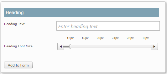
Heading
When the heading text has been entered you are able to adjust the size that the heading will be displayed using the font slider.
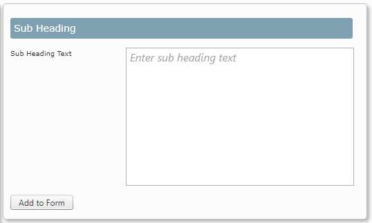
Sub Heading
This area provides space for instructions or other information to help the user complete the form. The Sub Heading will always appear below the Heading and can not be displayed in a different location. You do not have to use the Sub Heading but if you do only1 Sub Heading per form is available.
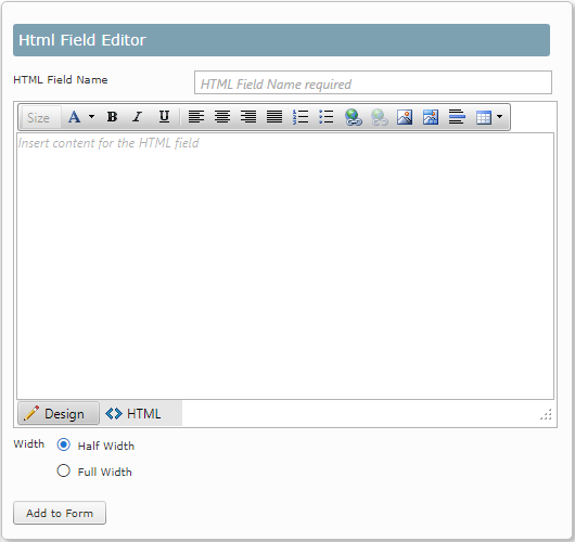
HTML Field Editor

Example of an image inserted at the top of a form
You can use the Html Field editor to insert pictures, links or other text to enhance your form. A company logo could be added or a divider to create visual sections on the form. This field offers the form creator great flexibility in the design and layout of the form, including changing the width between full and half page width.
Text Box

Example of a text field
A text box allows the user to enter text and numbers. There is no limit to the number of text fields that can be added to a form.
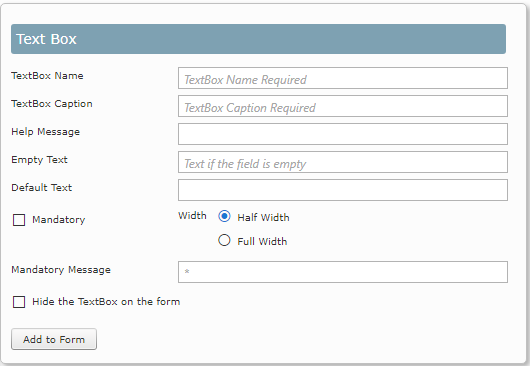
The name of the TextBox cannot be changed after it has been created and is used when processing the form. Enter the name that will show on the form i.e. the field label into the TextBox Caption field.
A message can be added underneath the text box to explain to the user the type of information that is required. Enter the text in the Help Message field to explain what details need to be entered in the field. This can be left blank.
You can enter Empty Text which will show before any information is entered. In the example above the instruction Please enter your name has been added.
If you want the field to automatically contain text then enter the text required in the Default Text field. This can be changed by the person completing the form if required.
If the field has been made mandatory it will show with a red asterisk. A message can be shown at the bottom of the screen if the user tries to save the form without completing the required field.
The size of the field can either be half the width of the online form (as in the example above) or be the full width of the form.
By selecting the tick field 'Hide the TextBox on the form the field will not be visible to the user.
Multiline Text Box

Example of a multi line text box
A Multiline text box allows the user to enter text and numbers. There is no limit to the number of Multiline text fields that can be added to a form.
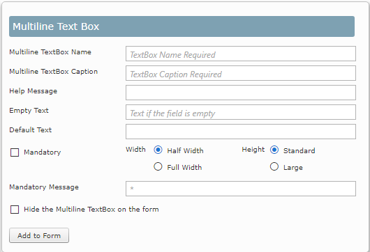
The name of the Multiline TextBox cannot be changed after it has been created and is used when processing the form. Enter the name that will show on the form i.e. the field label into the TextBox Caption field.
A message can be added underneath the text box to explain the the user the type of information that is required. Enter the text in the Help Message field to explain what details need to be entered in the field. This can be left blank.
You can enter Empty Text which will show before any information is entered. In the example above the instruction Please enter your name has been added.
If you want the field to automatically contain text then enter the text required in the Default Text field. This can be changed by the person completing the form if required.
If the field has been made mandatory it will show with a red asterisk. A message can be shown at the bottom of the screen if the user tries to save the form without completing the required field.
The size of the field can either be half the width of the online form or be the full width of the form (as in the example above). You can also select the height of the text box the be either Standard (as in the example above) or Large.
By selecting the tick field 'Hide the TextBox on the form the field will not be visible to the user.
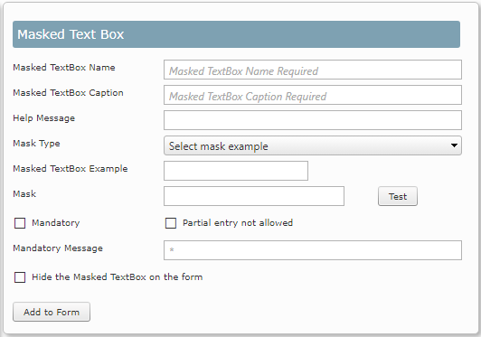
Masked Text Box

Example of a masked field
The name of the Masked TextBox cannot be changed after it has been created and is used when processing the form. Enter the name that will show on the form i.e. the field label into the TextBox Caption field.
A mask can be applied to a field so that any input is formatted in the required way. There are 7 masks included as examples. You can select one of the examples or create a custom one to suit your data.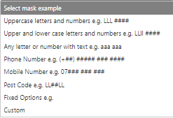
If you select one of the examples the layout of the mask will displayed in the Masked TextBox example field so that you can test the mask.
If you create a custom mask the following 3 masks are the most commonly used ones.
L = Uppercase letter
l = Lowercase letter
# = Number
Select the option Partial entry not allowed to prevent incomplete entries being added.
Check Box

Example of a check box
A CheckBox will allow the user to select an option. It is effectively as yes answer to a question if the box is selected. You can create as many CheckBoxes for your form as required.
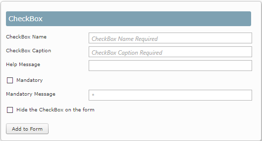
The name of the CheckBox cannot be changed after it has been created and is used when processing the form. Enter the name that will show on the form i.e. the field label into the CheckBox Caption field.
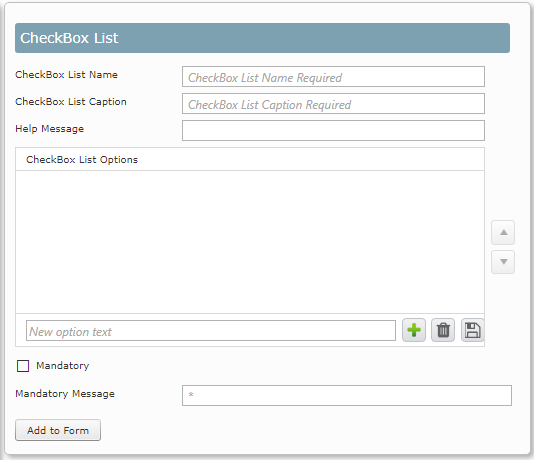
CheckBox List

Example of a CheckBox list
A CheckBox List enables the user to select more than one option. The help message is displayed under the options, as shown in the example above.
The name of the CheckBox List cannot be changed after it has been created and is used when processing the form. Enter the name that will show on the form i.e. the field label into the CheckBox Caption field.
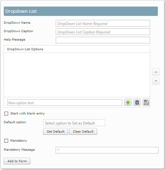
Dropdown List

Example of a Dropdown list
The dropdown list provides many options for the user to choose from but they are only able to select one of the options. You can select one of the options to be default so unless the user selects a different option, the default option will be used. The name of the DropDown cannot be changed after it has been created and is used when processing the form. Enter the name that will show on the form i.e. the field label into the DropDown Caption field.
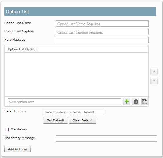
Options List

Example of a Options List
An options list is similar to the dropdown list as a users can only select from one of the options listed. You can also set one of the options as being the default option. The difference between an options list and a dropdown list is the way that the choices are displayed. The name of the Option List cannot be changed after it has been created and is used when processing the form. Enter the name that will show on the form i.e. the field label into the List Caption field.
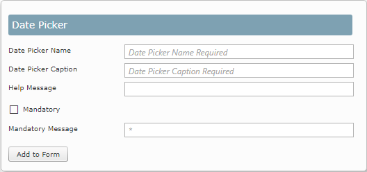
Date Picker

Example of Date Picker used in a form
Users can select a date from a calendar which is easy to use. This also ensures that all dates are formatted in the same way and there is no confusion. The date picker can be added as many times as required to a form.
The name of the Date Picker cannot be changed after it has been created and is used when processing the form. Enter the name that will show on the form i.e. the field label into the Date Picker Caption field.
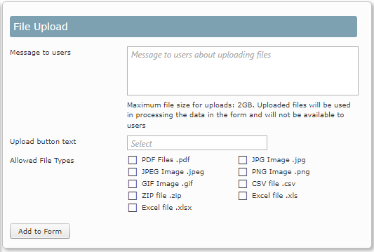
File Upload

Example of File Upload
There may be cases where an electronic file needs to be included with the form. You can add an upload button to the form which will upload a maximum file size of 2GB. When creating the button you need to select the type of files that you want to allow to be uploaded. There are 9 file types that can be selected for uploaded. You can also label your button with text appropriate to your form.
You can only add one File Upload button per form.
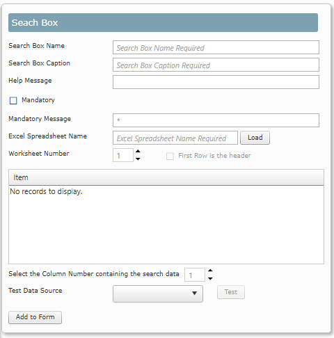
Search Box
You are able to enter information in the search field that does not match the spreadsheet. Customer forms that contain search fields can be exported and imported into a different skyline portal. You must make sure that the required Excel spreadsheet is installed on the new portal.
When creating the Excel file there are some guidelines that need to be followed.
| • | Calculated fields are not allowed |
| • | Do not include any hidden columns or rows |
| • | The Microsoft Excel XLSX file is stored in the Skyline > wwwroot > App_Data > SearchBoxFiles directory on the server. |